gtag('event', 'conversion', {'send_to': 'AW-381971820/DhGeCPCgsKsZEOzakbYB'});

News

Cash Cow Clues: Can Dividend Yields Forecast Interest Rates?

We have written many articles and commentaries forecasting interest rates. The analysis has used prior and current inflation and economic activity. Additionally, we have looked at market data on inflation expectations, Fed Funds futures, and other factors that influence interest rates. Today, we add an unorthodox factor to the list: cash cows.

This article introduces a unique way to imply where dividend investors think interest rates will be in the future. The impetus for this article came from a recent SimpleVisor Friday Favorites article in which we reviewed the Campbell Soup Company (CPB). Friday Favorites typically analyzes a company’s fundamental and technical conditions and valuations.

This time, however, because the company was a cash cow, we took it further and studied its dividend yield. In the process, we arrived at an implied ten-year U.S. Treasury yield based on the current and historical spread between Campbell’s dividend yield and the ten-year U.S. Treasury yield.    

Implying future interest rates based on CPB is somewhat laughable. However, implying future interest rates on a larger population of cash cows may be more telling.

Ad for financial planning services. Need a plan to protect your hard earned savings from the next bear market? Click to schedule your consultation today.

What Is A Cash Cow?

Cash cow is a term dairy farmers use to describe mature cows that generate milk regularly with minimum maintenance.

Wall Street adopted the term cash cow to label companies that deliver reliable cash flows (milk), require little investment (maintenance), and have little to no sales and earnings growth (mature).

CPB is a good example of a cash cow. Not surprisingly, the soup business is a low-growth venture; therefore, it has negligible earnings and sales growth. Moreover, it has consistently paid dividends since 1989 and produces plenty of excess cash flow that should ensure future dividend payments.

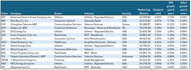
While CPB lives up to the definition of a cash cow, we do not analyze it in this article as its dividend yield is below our threshold dividend yield. However, we did find fifteen other cash cows, which we will share.

Screening For Cows

In this analysis, we used the following screening criteria:

  • Market Cap > $10 billion
  • Five-Year EPS Growth < 5%
  • Five-Year Sales Growth < 5%
  • Dividend Yield > 2.50%
  • Ten Years of Consecutive Dividend Payments

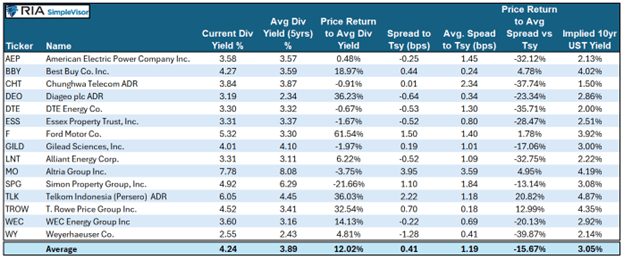
The table below shows the fifteen stocks that met the screening criteria.

cash cow screen results

Ad for The Bull/Bear Report by SimpleVisor. The most important things you need to know about the markets. Click to subscribe.

What Can We Imply With Dividend Yields?

The following table shares our analysis of the fifteen companies.

After the ticker and name of each respective stock, we show the current dividend yield and the average dividend yield over the last five years. The next column, “Price Return to Avg. Div. Yield”, quantifies how much the stock price would have to change to bring the current dividend yield in line with the five-year average. Obviously, a company can increase its dividend or cut it, which would change the return.

The first set of analyses, which we just described, helps us compare the current dividend yield to recent yield history on an absolute basis.

Since some investors consider bonds a substitute for dividend stocks, we must also do a relative analysis of dividend yields. In other words, has the dividend yield risen accordingly with interest rates? To do this, we calculate the current dividend yield minus the current ten-year yield (“Spread to Tsy”). We also compute the average Spread to Tsy. for the last five years. With this data, we can calculate how much the stock price would have to change to make the dividend yield equal to its five-year average spread to Treasury yields.

Lastly, assuming the dividend yield reasonably predicts where rates are headed, we can imply where the ten-year U.S. Treasury yield may be in the near future. We share this in the column furthest to the right.

cash cow dividend yields

Ad for SimpleVisor. Get the latest trades, analysis, and insights from the RIA SimpleVisor team. Click to sign up now.

Cash Cow Conclusions

While there are many stories within the table, we focus on the averages of the fifteen stocks in this article. The current dividend yields are slightly higher than average. This is primarily a function of investors shunning dividend stocks in favor of higher-yielding bonds or stocks with better performance. Declining stock prices push the dividend yield higher, helping them stay competitive with bonds. Dividend yield is only one of many factors determining the price; however, it is a much more critical price determinant for cash cows than other stocks.

While the dividend yield may be higher than its norm for the last five years, it has not kept up with Treasury yields. Based solely on the yield spread, prices, on average, would need to fall by about 15% to bring the meager .41% spread over the 10-year UST back to normal.

But might stock investors be locking in higher dividend yields, anticipating a lower interest rate/yield environment? If so, our cash cows imply the 10-year UST yield would need to fall to 3.05%. Doing so will bring the average dividend yield spread versus Treasury yields back to its average.

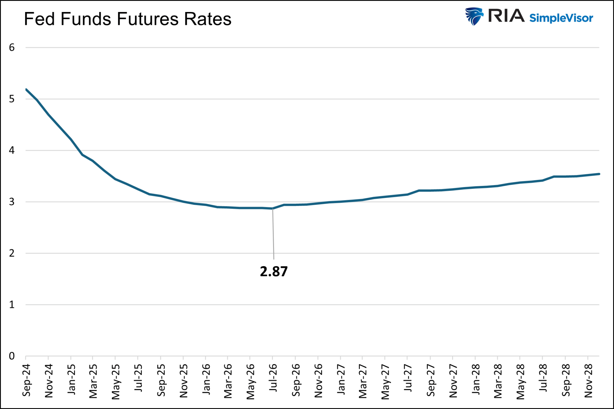
Coincident or not, the market also thinks that the Fed Funds rate will trough at 2.87% when the coming rate-cutting cycle ends.  

Fed funds futures rates

Summary

Between our article Fed Funds Futures Offer Bond Market Insights and the cash cows we highlight, the Fed Funds futures market and stock market appear to be on the same page regarding future interest rates.

Some may find comfort in their similar predictions. However, caution is warranted. The bond market often underappreciates how much the Fed will cut interest rates. Furthermore, it has been proven to be a poor judge of where long-term Treasury bond yields will fall. Quite often, yields fall much more than anticipated. If this is again the case, some of our cash cows may see decent price appreciation if their dividend yield declines with lower bond yields.

The post Cash Cow Clues: Can Dividend Yields Forecast Interest Rates? appeared first on RIA.

S&P 500 – A Bullish And Bearish Analysis

The S&P 500 index is a critical benchmark for the U.S. equity market, and its performance often dictates investor sentiment and decision-making. Between November 1, 2022, and September 6, 2024, the S&P 500 experienced a significant rally but not without volatility. Currently, investors have very mixed views about where markets are heading next as concerns of a recession linger or what changes to monetary policy will cause.

However, as investors, we must trade the market we have today. Therefore, using technical analysis, we can explore bullish and bearish market dynamics to assist us in managing risk more effectively. This blog will outline three bullish and bearish perspectives using momentum, relative strength, and other key technical indicators. Finally, we will conclude with five actionable steps investors can take today to mitigate risk.

(Note: All data is as of the Friday, September 6 close.)

Bullish Outlook

1. Strong Support at Key Moving Averages

One of the primary bullish signals for the S&P 500 is its tendency to find support at critical moving averages. Throughout the analyzed period, the 50, 100, and 200-day moving averages supported the index significantly, particularly in late 2023 and early 2024. Even though the index faced downward pressure in August, its ability to bounce from the 150-day moving average indicates that buyers continue to find levels to increase equity exposure. Given the market has remained steadily above the 200-DMA and that average is trending higher, it signals that the longer-term bullish trend remains intact.

S&P 500 Market vs Moving Averages

2. Momentum Indicators Point to Potential Reversal

Momentum indicators such as the Moving Average Convergence Divergence (MACD) have recently triggered a short-term “sell signal,” which coincides with the recent price correction. However, while these signals have coincided with lower prices in the near term, they have consistently bottomed between -25 and -50. Such has provided investors with repeated opportunities to increase equity exposure over the last two years. When the MACD begins to register readings below -50, such has historically indicated when markets are turning from upward trending to lower trending prices.

S&P 500 Market vs MACD

3. Relative Strength Index (RSI) Near Oversold Levels

The Relative Strength Index (RSI) measures the magnitude of recent price changes. As of Friday’s close, the RSI is approaching more oversold levels near 30. While not there yet, which suggests markets could see additional weakness in the near term, low readings historically signal short-term market bottoms. Readings of 30 or below indicate that the selling pressure is likely overextended, and buyers tend to regain market control. In April and August 2024, the RSI hovered around these oversold levels, providing a strong signal for bullish traders to take advantage of a bounce. While the recent correction likely has further to go, the current low RSI readings suggest a bounce is likely. Investors should use any rally to rebalance portfolio risk.

S&P 500 Market vs RSI

However, investors should also consider the bearish warnings.

Bearish Outlook

1. A Lower High

From a bearish perspective, the recent lower high of the market is concerning. If the market declines and sets a lower low, that is one of the more telling technical signals indicating a new potential bearish trend. Lower highs suggest buyers are losing conviction, and each new rally is weaker than the previous one. Simultaneously, lower lows suggest that selling pressure is increasing. This pattern, if sustained, could indicate a deeper corrective phase, possibly targeting lower support zones between 4600 and 5200. While the recent lower high is very early, a recent pattern to review is 2022.

S&P 500 Market Lower Highs

If the market rallies in the weeks ahead, setting a new high, that price action will negate the warning from lower highs.

2. Decreasing Volume of Rallies

Another bearish indicator is the declining trading volume during recent rallies. According to technical analysis principles, strong price moves should be accompanied by increasing volume, signaling widespread market participation. However, rallies in the S&P 500 over the last two months coincided with lower volume levels. As discussed previously, these negative divergences warned investors that the upward move lacks conviction. The divergence between price and volume forewarned of this recent correction.

S&P 500 Market vs Volume

3. Longer-Term MACD Signals Turn Bearish

We regularly publish our longer-term technical analysis and statistics in the weekly Bull Bear Report (Subscribe for FREE). One of those charts is the Weekly Risk Management Analysis. The chart below matches an intermediate and longer-term weekly MACD signal to the markets. When both signals are on “buy signals,” such has coincided with a trending bull market advance. When both signals confirm a “sell,” as in early 2022, the market has gone through correctional phases.

Currently, while early, both the intermediate and longer-term MACD “sell” signals are registered. There are several crucial points to note:

  1. The market is trading at the top of its long-term trend channel from the 2009 lows. While it previously traded above that channel in 2021 due to artificial stimulus, the current advance may be near its current cycle peak.
  2. These are weekly signals and, therefore, very slow to move. Signals can whip back and forth for a month or so before becoming confirmed by a breakdown in the market.
  3. As noted, the market’s price action needs to confirm the “buy” and “sell” signals. If the market enters a deeper corrective phase, a break of the 200-DMA will confirm the end of the bullish advance that started in 2022.

Notably, while bullish and bearish signals exist, the market can remain in flux for quite some time. For example, the market is approaching oversold territory based on RSI, which typically suggests a reversal. However, the bearish price action and weak volume indicate that caution is warranted. Therefore, while some technical indicators provide conflicting signals, investors must manage near-term risk while waiting for markets to confirm their next direction.

Ad for SimpleVisor. Get the latest trades, analysis, and insights from the RIA SimpleVisor team. Click to sign up now.

5-Actions Investors Can Take Today to Minimize Risk

Given the mixed technical outlook for the S&P 500, investors should focus on managing risk while positioning themselves for potential market swings. Here are five actions to consider:

1. Trim Winning Positions Back to Their Original Portfolio Weightings

This strategy involves reducing your exposure to positions that have grown beyond their initial allocation due to price appreciation. When a particular asset or stock performs well, its weight in the portfolio increases, potentially leading to overexposure and imbalance. Trimming these positions back to their original weight helps lock in profits while maintaining your intended risk profile. It’s a way to ensure that no single asset dominates the portfolio, which could lead to increased risk if that asset faces a downturn.

2. Sell Those Positions That Aren’t Working

Selling underperforming assets is essential for managing risk and avoiding unnecessary losses. Suppose a stock or asset consistently underperforms relative to its peers or the market. In that case, it may be a sign that the investment thesis has failed or external factors negatively affect the position. Selling these positions frees up capital investors can reallocate to better-performing or more stable assets. It’s a proactive step to cut losses and prevent further erosion of your portfolio value.

3. Move Trailing Stop Losses Up to New Levels

A trailing stop loss is a risk management tool that automatically adjusts as a stock price rises, locking in profits and protecting against downside risk. Moving these stop-loss levels up as the price of an asset increases ensures that if the market reverses, you can capture gains without manually monitoring and selling the position. This strategy helps protect profits while allowing for further upside potential. It’s advantageous in volatile markets where prices can fluctuate significantly.

4. Review Your Portfolio Allocation Relative to Your Risk Tolerance

You should always align your investment portfolio with your risk tolerance, which may change over time due to market conditions or personal factors such as age, income, or financial goals. Reviewing your portfolio allocation means assessing how much your portfolio is invested in different asset classes (e.g., stocks, bonds, cash) and ensuring the risk level matches your current comfort level. For instance, if your portfolio has become more aggressive (higher exposure to stocks or growth assets), you may need to rebalance to reflect a more conservative risk profile, particularly as market conditions change.

5. Raise Cash Levels And Add Treasury Bonds to Reduce Portfolio Volatility

Increasing your cash allocation is a simple but effective way to reduce portfolio volatility. In times of uncertainty or market downturns, holding more cash can help minimize losses and provide liquidity for future opportunities. Cash is a low-risk asset that doesn’t fluctuate with the market, so increasing your cash position can help stabilize the overall portfolio and provide peace of mind during volatile periods.

Furthermore, investors consider Treasury bonds safer investments than stocks, providing stability and predictable income through interest payments. Adding bonds to a portfolio can help reduce volatility, particularly during economic uncertainty or stock market corrections. Bonds tend to have an inverse relationship with stocks, meaning they can perform well when equities struggle, particularly during Fed rate-cutting cycles.

Conclusion

The S&P 500’s technical landscape presents both opportunities and challenges. Bullish indicators such as support at the 200-day moving average and oversold RSI levels suggest a “buy the dip” opportunity could be on the horizon. However, bearish patterns like lower highs and weakening volume during rallies warn of further downside risks.

We don’t know what will happen next, nor does anyone else. Therefore, we suggest a regular diet of risk management and portfolio rebalancing to navigate periods of elevated uncertainty.

Could I be wrong? Absolutely.

But what is worse:

  1. Missing out temporarily on some additional short-term gains or
  2. Spending time getting back to even, which is not the same as making money.

Opportunities are made up far easier than lost capital.” – Todd Harrison

Trade accordingly.

The post S&P 500 – A Bullish And Bearish Analysis appeared first on RIA.

Technological Advances Make Things Better – Or Does It?

It certainly seems that technological advances make our lives better. Instead of writing a letter, stamping it, and mailing it (which was vastly more personal), we now send emails. Rather than driving to a local retailer or manufacturer, we order it online. Of course, we mustn’t dismiss the rise of social media, which connects us to everyone and everything more than ever.

Economists and experts have long argued that technological advances drive U.S. economic growth and productivity. As innovations emerge, they play a crucial role in shaping the economy, improving efficiency, and enhancing productivity across various sectors. From artificial intelligence to automation, the benefits of technological progress are widespread and profound.

For example, automation and artificial intelligence have streamlined manufacturing processes, reducing the need for manual labor and minimizing human error. This efficiency boost leads to faster production times and reduced costs, lowering prices while improving profit margins. Higher productivity levels contribute to overall economic growth, as businesses can produce more goods and services with the same resources.

Another significant benefit is the creation of new industries and job opportunities. As technology evolves, it creates demand for new skills and expertise, leading to the development of entirely new sectors. For example, the rise of the technology industry gave birth to jobs in software, data analysis, and cybersecurity, among others. These high-paying jobs contribute to economic growth by increasing consumer spending and driving innovation.

Ray Kurzweil’s 1999 book, “The Age of Spiritual Machines,” introduced the concept of “The Law of Accelerating Returns. Ray predicted that the rate of technological advances is exponential rather than linear. That means that technology builds on itself in a positive feedback loop, allowing each generation to advance at an increasing rate.

Accelerating pace of technology

Kurzweil’s predictions related to this theory have proven remarkably accurate. He predicted technologies such as the internet and the growth in mobile computing power years before they emerged. Out of 147 predictions he made in the 1990s about the future up to 2009, 115 (78%) were correct.

However, were economists’ predictions about the benefit of technology as accurate as Kurzweil’s?

The Dark Side Of Technological Advancement

While technological advances seem to produce an enormous benefit, a dark side gets hidden from public discourse.

One primary concern is job displacement. Automation and artificial intelligence, while improving efficiency, often replace jobs traditionally performed by humans. This displacement mainly affects low-skilled workers in industries like manufacturing and retail, leading to unemployment and underemployment. As machines take over routine tasks, the workforce faces the challenge of reskilling to meet the demands of a more technologically advanced economy. That transition period can lead to economic slowdowns and increased inequality, as not all workers have the means or opportunity to adapt quickly.

The chart below shows the trend of employment versus actual employment. Since 1947, employment has grown with the economy, as expected. However, employment changed in the late 90s as employment fell below the previous growth trend, coinciding with the Internet adoption. The need for employees eroded as the internet fostered technological advances in everything from manufacturing automation to online sales, social media, advertising, and business management. Today, the deviation in employment from the long-term growth trend is the largest in history outside of the pandemic-driven economic shutdown.

Employment "real situation" report

Another issue is the increasing concentration of wealth and market power in the hands of a few technology giants. Companies like Amazon, Google, and Apple dominate their respective markets, creating barriers to entry for smaller firms. As shown, as technological advances increased, there has been a clear shift in corporate earnings and concentration. Again, starting in the late 90s, increased technological advances reduced the number of employees required to produce goods and services. At the same time, the market became increasingly concentrated in a smaller group of companies.

Employment to population ratio

Monopolistic behavior stifles competition, reduces innovation, and limits consumer choice. Furthermore, corporate profitability soared by reducing labor, which is the most costly expense for any business.

Corporate profits to wages

The vast wealth accumulation by these companies contributes to economic inequality. That inequality can hamper overall economic growth by reducing the average consumer’s purchasing power. Since 1990, wealth inequality has soared, with those in the top 10% owning a vast majority of economic wealth. The bottom 50%, which comprises a significant portion of employee labor in the manufacturing and services industries, have barely benefitted.

Household net worth by quintile.

Lastly, the rapid pace of technological change can lead to productivity paradoxes, where the expected gains in productivity from new technologies do not materialize as anticipated. That happens due to the significant time and investment required to integrate new technologies effectively into existing business processes. Additionally, cybersecurity threats, data privacy concerns, and technology-driven stress can undermine productivity and lead to economic inefficiencies.

But there is even a darker side that no one is talking about.

banner ad for SimpleVisor, our do it yourself investing tool. sign up for your free trial now

Social Loneliness

While social media and the internet have revolutionized the way we connect and communicate, they have also contributed to several severe societal issues, including increased loneliness, social and political division, and a troubling rise in teenage suicides. Understanding these negative impacts is crucial for addressing the challenges of the digital age.

One significant consequence of social media is the rise in loneliness. Despite the promise of connecting people, social media often leads to superficial interactions, which lack the depth and intimacy of face-to-face communication. As users compare their lives to the seemingly perfect lives of others online, feelings of inadequacy and isolation can increase. That can be particularly damaging for teenagers, as they are at a critical stage of developing their self-identity and sense of belonging. The constant need for validation through likes and comments can lead to feelings of loneliness and anxiety.

Gen Z is lonely

Social media also contributes to social and political division. The algorithms that power these platforms often promote content aligning with users’ beliefs, creating echo chambers reinforcing biases. This polarization can deepen societal divisions, making constructive dialogue and mutual understanding more difficult. The spread of misinformation and fake news further exacerbates these divisions, exposing people to misleading content that can shape their perceptions and opinions. With a growing inability to logically and rationally discuss our differences, passing laws and policies that benefit everyone has become impossible.

Political Divide in America

Lastly, and most unfortunately, the impact of social media on teenage mental health is alarming. Studies have shown a link between heavy social media use and increased rates of depression, anxiety, and suicidal thoughts among teenagers. The pressure to fit in, the prevalence of cyberbullying, and the exposure to unrealistic standards of beauty and success can create a toxic environment that negatively affects teens’ mental well-being. Tragically, this can lead to an increase in teenage suicides (as shown by the CDC) as vulnerable individuals struggle to cope with the pressures of the digital world.

Teenage suicide rates

In conclusion, while technology is a powerful driver of economic growth, it also presents challenges that can negatively impact productivity, equality, mental health, and societal cohesion. Addressing these issues ensures that technological advancements promote sustainable and inclusive economic growth.

After all, that was the promise of technology, to begin with.

The post Technological Advances Make Things Better – Or Does It? appeared first on RIA.

Bull Steepening Is Bearish For Stocks – Part Two

Part One of this article described the burgeoning bull steepening yield curve environment and what it implies about economic growth and Fed policy. It also discussed the three other predominant types of yield curve shifts and what they suggest for the economy and Fed policy.

Persistent yield curve shifts tend to correlate with different stock performances. With the odds growing that a long bull steepening may be upon us, it’s incumbent upon us to quantify how various stock indices, sectors, and factors have done during similar yield curve movements.

Limiting Losses With Yield Curve Analysis

Stocks spend a lot more time trending upward than downward. However, in those relatively brief periods where longer-term bearish trends endure, investors are advised to take steps to reduce their risks and limit their losses. An active approach puts you on higher ground than you otherwise might have been. Moreover, when the market resumes its upward trend, you have ample funds to purchase stocks at lower prices and better risk-return profiles.

We discussed this topic at length in Bear Market Wealth Management. Per the article:

Growing wealth happens over decades. Within these decades are many bullish and bearish cycles. While investors tend to focus on making the most of the bullish cycles, it is equally important to avoid letting bear markets reverse your progress. The amount of time spent in bear markets is minimal, but the time lost recovering your wealth can be substantial

You may wonder why an article about bond yield curves leads off with a discussion of bear market strategies for stocks. Simply, some yield curve shifts correlate well with positive stock market returns and others with negative returns. Prior bull steepening environments have not been friendly to buy and hold stock investors. Therefore, we hope this analysis guides you in preparing to reduce risk if needed.

Ad for financial planning services. Need a plan to protect your hard earned savings from the next bear market? Click to schedule your consultation today.

The Recent Bull Steepening History

The graph below charts the 2- and 10-year yields and the 2-year/10-year yield curve. Additionally, shaded in gray are periods we deem persistent bull steepening. We defined the bull steepening periods by the curve’s movement and the trend’s consistency. To qualify, the yield curve had to be increasing, with 2-year and 10-year yields moving lower for 20 weeks or longer. Furthermore, we required at least 80% of the weeks to be in the bullish steepening trend.

As shown, there have been five such periods since 1995. The most recent stretched from May 2019 to March 2020. The current bull steepening has not been occurring long enough to meet our standards defined above.

bull steepening periods

Bull Steepening Cycles Are Bearish For Most Stocks

Having defined the periods, we then studied various stock indices, sectors, and factors to assess their performance during the timeframes. To remind you, bull steepening trades typically occur when the economy is slowing, and anticipation of Fed rate cuts grows. Those traits adequately describe the current period.

Furthermore, and of importance, the current steepening is occurring from a yield curve that has been inverted for two years. Inverted means the yield on the 10-year is less than the 2-year. An inversion reduces the incentives for banks to lend, thus further increasing the odds of economic weakness.

As noted in Part One, the yield curve inversion is a recession warning but is not usually timely. Contrarily, the yield curve un-inversion typically portends a recession is coming within a year or less.

The yield curve briefly returned to positive territory as we put the final edits on this article. Therefore, we now have a much more explicit recession warning.

The graph below shows that even though we have a firmer warning, a recession can take more than a year to enter.

yield curve uninversions

Bond Returns

By definition, all Treasury bonds provide positive returns in a bull steepening. While two-year yields will fall more than ten-year yields, the duration on ten-year notes is much greater. Thus, from a total return perspective, longer-duration bonds often provide better returns than shorter-duration bonds.

The table below shows the total return (coupons and price) for two- and ten-year notes during the five bull steepening periods.

bond returns bull steepening

Ad for The Bull/Bear Report by SimpleVisor. The most important things you need to know about the markets. Click to subscribe.

Stock Returns

The first graph below charts the average returns of 19 assets, stock indices, factors, and sectors during the five bull steepening periods. The second graph compounds their returns over the five periods. 

bull steepening average returns

total compounded returns

Next, we break out the returns by similar classes of stocks. We added gold and gold miners to the factor returns graph. The graphs show the average return and the average of the maximum drawdowns during the five periods.

index returns and drawdowns

sector returns and drawdowns

factors returns and drawdowns

There are a few important takeaways:

  • Gold and gold miners are the best performers during bull steepening periods by a long shot.
  • Besides gold and gold miners, staples were the only other category with a positive compounded and average return.
  • Every index, sector, asset, and factor, including gold and gold miners, had a negative average return at some point during the steepening period.
  • The differences between S&P value and growth were not as significant as we suspected they would be.
  • Similarly, the differences between the S&P 500 and the S&P small and mid-cap indexes were minimal.
  • The lower beta, more value-oriented sectors clearly outperformed the higher beta sectors and factors during the steepening shift.

Ad for SimpleVisor. Get the latest trades, analysis, and insights from the RIA SimpleVisor team. Click to sign up now.

A Disclaimer About Expectations

It’s easy to extrapolate the past to the future. However, each of the five periods above was different. There is no doubt that the next persistent bull steepening, whether we are in it now or in the future, will have different characteristics. Past performance may not be a reliable indicator of the future.

We are currently 12 weeks into a bull steepening cycle. If it persists for another eight weeks, it will meet the threshold we used to calculate the results above. However, if that is the case, the data to calculate the expected returns and drawdowns will start from late May. The early start date could skew our expectations.

For instance, gold is up about 10% from the start date. If this is a persistent bull steepening cycle and gold ultimately matches the average 13% return over the prior five periods, it has limited upside. However, its average drawdown during the previous periods is about 6%.

Therefore, if this instance matches the average return and drawdown, we should expect gold to fall by 15% before rebounding to about 3% more than current levels.

Similarly, the sectors with prices higher than their late May levels could decline by more than the average return from current levels to match the average return.

Summary

The results of our study are relatively consistent across the five time frames. Therefore, if the current bull steepening continues, the likelihood that gold, gold miners, and the more conservative, lower beta sectors outperform the broader market is good.

The recent performance of the utility and staples sectors, along with gold and gold miners, might hint that investors are betting on a bull steepening.

We leave you with two graphs showing the importance of risk management during a bull steepening cycle that leads to a recession.

stocks and bonds through economic cycles

stock and bond returns when the Fed cuts rates

The post Bull Steepening Is Bearish For Stocks – Part Two appeared first on RIA.

Scroll to Top